One of the new controls supported by OpenInsight 10 is the Windows Progress Bar control which is used to display the progress of lengthy operations.

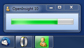
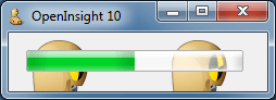
Windows 7 Aero Progress Bar
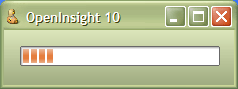
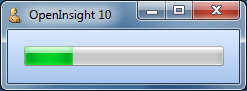
Windows XP Progress Bar
It is a fairly simple control and supports the following properties:
- BORDER
- ERRORCOLOR
- MARQUEE
- NORMALCOLOR
- PAUSEDCOLOR
- RANGE
- SHOWTEXT
- SMOOTH
- STATE
- STEP
- SYNCTASKBAR
- TEXT
- TRANSLUCENCY
- VALUE
- VERTICAL
And the following methods:
BORDER property
Setting this boolean property to TRUE (“1”) draws a border around the control. This is the default value.

Translucent XP Progress Bar without a border
ERRORCOLOR property
This property is a standard color value and sets the color of the bar when it is in the “error” state (see the STATE property below). Depending on the visual style in use this property normally defaults to a red color.

Windows Classic smooth style Progress Bar with an ERRORCOLOR of 255 (red)
MARQUEE property
This property is an integer value that contains the time in milliseconds between marquee animation updates. Setting it to 0 stops the marquee animation.

Aero Progress Bar with a MARQUEE property of 50 (i.e. it animates every 50 ms)

Windows XP Progress Bar with a MARQUEE property of 50
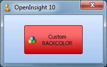
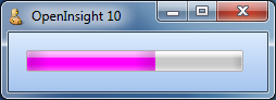
NORMALCOLOR property
This property is a standard color value and sets the color of the bar when it is in the “normal” state (see the STATE property below). Depending on the visual style in use this property normally defaults to a green color, though in other schemes like “XP Olive” this defaults to an orange color instead.

Windows 7 Aero progress Bar with a purple NORMALCOLOR (255,0,255)
PAUSEDCOLOR property
This property is a standard color value and sets the color of the bar when it is in the “paused” state (see the STATE property below). Depending on the visual style in use this property normally defaults to an amber or yellow color.

Windows 7 Aero segmented Progress Bar with a STATE of “3” (paused)
RANGE property
This property is an @fm-delimited array of two integers containing the upper and lower limits of the progress bar.
<1> Low limit
<2> High Limit
The VALUE property must be between these two values.
SHOWTEXT property
Setting this property to TRUE (“1”) will display the contents of the TEXT property in the center of the progress bar. The default is FALSE ( “0”).
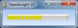
SMOOTH property
Setting this property to TRUE (“1”) causes the progress indicator to be drawn as a continuous bar rather than in the usual segmented style.

Windows Classic Smooth Progress Bar – i.e. a SMOOTH style of TRUE (“1”)
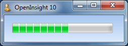
Windows 7 Aero segmented Progress Bar – i.e. a SMOOTH style of FALSE (“0”)
STATE property
This property sets the visual state of the progress bar. It can be one of the following values:
- “1” – Normal (green)
- “2” – Error (red)
- “3” – Paused (yellow)
Each of these states has a default color as indicated above but this can be changed by one of the bar color properties (NORMALCOLOR, ERRORCOLOR and PAUSEDCOLOR).
Examples:

Windows 7 Aero Progress bar with a STATE property of 2

Windows 7 Aero Progress bar with a STATE property of 3
STEP property
This property is a simple integer and is used in conjunction with the INCREMENT method. If the latter is called with no value the progress bar is incremented by the amount specified in this property.
SYNCTASKBAR property
When set to TRUE (“1”) the parent form’s taskbar button is automatically updated to mirror the state of the Progress Bar control (as per our previous post on Taskbar Integration).
Windows 7 Aero Progress Bar with SYNCTASKBAR set to TRUE (“1”)
This property has no effect unless the application is running on Windows 7 or higher.
TEXT property
This property is the same as the standard TEXT property. However, any occurrences of the substring “%p%” within the text will be replaced with the current percentage complete.
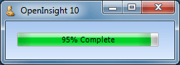
Windows 7 Aero Progress Bar with a TEXT property of “%p% Complete”
TRANSLUCENCY property
This property specifies the transparency of the control’s background (i.e. the progress bar itself is not affected). It is based on simple percentage amount, “0″ being fully opaque and “100″ being fully transparent (and therefore not visible).
Windows 7 Aero Progress Bar with a TRANSLUCENCY of 50
VALUE property
This simple integer property sets the current value (position) of the progress bar. It should be a value between the limits set by the RANGE property.
Windows 7 Aero Progress Bar with a RANGE of [0,200] and a VALUE of 50
VERTICAL property
Setting this property to TRUE (“1”) draws the progress bar in a vertical fashion – i.e. it increments from the bottom to the top.

Windows 7 Aero Progress Bar with a VERTICAL property of TRUE (“1”)
DECREMENT method
exec_Method( ctrlEntID, "DECREMENT", amount )
This method decrements the progress bar by a specified amount. If no amount is specified the bar is decremented by the value contained in the STEP property instead.
INCREMENT method
exec_Method( ctrlEntID, "INCREMENT", amount )
This method increments the progress bar by a specified amount. If no amount is specified the bar is incremented by the value contained in the STEP property instead.
Further reading
More information on Progress Bars can be found on the MSDN site here, along with some user interface guidelines here.
(Disclaimer: This article is based on preliminary information and may be subject to change in the final release version of OpenInsight 10).


 Building OpenInsight 10