Monthly Archives: July 2013

Split-Button controls

Continuing with the recent focus on Button controls, this time we’re going to take a look at another new Button feature: Split-Buttons.

Split-Button

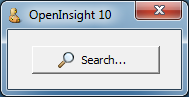
Split-Button using Aero styling

This button style was introduced with Windows Vista (*) and basically divides the button into two parts: The main part behaves like a normal push-button and fires a CLICK event when pressed, whilst the other part (normally drawn with a down arrow) fires a DROPDOWN event instead of a CLICK (if a context menu is linked to the button then this is displayed instead).

Split-Button support in OpenInsight 10 is exposed via the following properties:

  • SPLITBUTTON
  • SPLITWIDTH
  • SPLITSEPARATOR

SPLITBUTTON property

To enable Split-Button functionality the SPLITBUTTON property can be set to one of the following values:

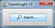
  • “R” – creates a Split-Button with the main part to the left and the drop-down arrow part on the right.
  • “L” – creates a Split-Button with the main part to the right and the drop-down arrow part on the left.
Left-aligned Split-Button

Left-aligned Split-Button using XP-styling

Setting the SPLITBUTTON property to NULL (“”) removes the Split-Button styling from the control.

SPLITWIDTH property

This property specifies the size in pixels of the arrow part of the control.

SPLITSEPARATOR property

The functionality of a Split-Button can be changed by the SPLITSEPARATOR property.  By default the property is TRUE (“1”), but when set to FALSE (“0”) the line between the two parts of the button is removed and the entire button then behaves as a “drop-down button” – i.e. clicking the button displays a context menu or fires a DROPDOWN event.

Split-Button without separator

Aero-style Split-Button without separator

The Split-Glyph API

For those of you who really can’t help customizing as much as possible the Split-Button also supports an API to allow you to change the default down arrow in the drop-down part of the control. This is the “Split-Glyph API” and mirrors most of the normal Button control “Glyph API” described previously. The only difference is the name of the properties – they are all prefixed with “SPLIT”, i.e.

  • SPLITGLYPH
  • SPLITGLYPHCOLORKEY
  • SPLITGLYPHCOUNT
  • SPLITGLYPHFRAMECOUNT
  • SPLITGLYPHFRAMENUMBER
  • SPLITGLYPHOFFSET
  • SPLITGLYPHORIGIN
  • SPLITGLYPHSIZE
  • SPLITGLYPHTRANSLUCENCY
Split-Button with split-glyph

Split-Button with split-glyph using XP styling

(*) Although Microsoft only introduced Split-Buttons into Windows with the release of Vista, (and then only with visual styles enabled) it should be noted that the OpenInsight Split-Button is supported on XP as well, even running under the Windows Classic theme.

Classic mode Split-Button

Classic mode Split-Button

(Disclaimer: This article is based on preliminary information and may be subject to change in the final release version of OpenInsight 10).

Button controls

Perhaps one of the controls most in need of a face-lift in OpenInsight is the Button (a.k.a PUSHBUTTON) control, and in this post we’ll take a look at some of the new features we’ve added to it for version 10.

Image API

Buttons in OpenInsight have always supported background images and version 10 is no different.  However we’ve extended the number of image states from 6 to 10 to give you a few more options if you want to use them:

  1. Up
  2. Down
  3. Disabled
  4. <not used>
  5. Up with focus
  6. Down with Focus
  7. Hot
  8. Hot with focus
  9. Default
  10. Default with focus

Of course you don’t have to supply all of these images – the system will attempt to pick the closest match based on the IMAGECOUNT supplied.  Access to the image properties is exposed via the normal Image API with the exception of the IMAGENUMBER property which is managed automatically depending on the button state.

Glyph API

One of the biggest drawbacks with using buttons in previous versions of OpenInsight is that images have only ever been applied to the background as a whole.  In order to create a button with an icon (or glyph, as we’ll refer to it henceforth) it has always been necessary to provide an image file with the entire button background drawn on it as well as the required glyph and text.  This makes it very difficult to provide a solution that looks good across different color schemes and visual styles, and it also makes any sort of runtime customization problematic too.

For version 10 a new API has been added for buttons called the “Glyph API”. This allows you to specify an image for the button that is drawn on top of the normal background like so:

Classic-style button with glyph

Classic-style button with glyph

XP-style button with glyph

XP-style button with glyph

Aero-style button with glyph

Aero-style button with glyph

Win8-style button with glyph

Windows 8-style button with glyph

It is exposed via the following properties:

  • GLYPH (similar to the BITMAP or IMAGE property)
  • GLYPHALIGN
  • GLYPHCOLORKEY
  • GLYPHCOUNT
  • GLYPHFRAMECOUNT
  • GLYPHFRAMENUMBER
  • GLYPHOFFSET
  • GLYPHORIGIN
  • GLYPHLAYOUT
  • GLYPHSPACING
  • GLYPHSIZE
  • GLYPHTRANSLUCENCY

These properties are very similar to their counterparts in the normal Image API with the exception of the following Button-glyph specific ones:

GLYPHLAYOUT property

This property specifies how the glyph is laid out in relation to the text, and can be one of the following values:

  • “0” – Glyph to the left, text to the right
  • “1” – Glyph to the top, text to the bottom
  • “2” – Glyph to the right, text to the left
  • “3” – Glyph to the bottom, text to the top.
Buttons showing  glyph layouts

Aero-style buttons showing glyph layouts

GLYPHSPACING property

This property is simply the number of pixels between the glyph and the text.

Where’s the GLYPHNUMBER property?

Just as the Button Image API has no IMAGENUMBER property there is no corresponding GLYPHNUMBER property either – this is because you can provide more than one image for a glyph and the system will automatically select one for you based on the button state (just like with background images).  These states are:

  1. Button up
  2. Button down
  3. Button disabled
  4. Button hot
  5. Button default

Note that if you don’t supply a disabled Glyph image and you disable the button the system will draw a grayed version of the glyph for you:

Button with disabled glyph

Aero-style buttons with system-drawn disabled glyph

Flat buttons

Flat “toolbar” style buttons are supported by the boolean FLAT property.  I.e. the actual background is not painted until the mouse is moved over the button.

Flat button

Aero-style flat button

Flat button with translucency

Aero-style flat buttons with 50% translucency

Custom colors

The button BACKCOLOR property fully supports custom colors and generates a set of matching 3D highlight and shadow colors to use when rendering.

Button with red BACKCOLOR

XP-style button with red BACKCOLOR

The FORECOLOR property also makes a welcome return and is now respected regardless of the visual style in use.

Button with red FORECOLOR

Aero-style button with red FORECOLOR

Extended mouse support

Like the updated Label control the Button now supports the following new properties when the button is in the “hot” state (i.e. the mouse is moving over it):

  • HOTFONT
  • HOTFORECOLOR
  • HOTBACKCOLOR

It also supports the new MOUSEOVER event so you can easily track mouse movements without having to resort to using WINMSG events.

Text Alignment and position

TEXTORIGIN property is provided that allows you to specify the exact XY position that you wish the text to be drawn at in a similar manner to the GLYPHORIGIN property.  Horizontal text alignment is also supported by the TEXTALIGN property.

(Disclaimer: This article is based on preliminary information and may be subject to change in the final release version of OpenInsight 10).

Hyperlink controls

Following on from the previous post on Label controls another new item we’ve added to OpenInsight is the Hyperlink control, which is essentially a specialized Label control that allows you to implement clickable links on your forms.

Hyperlink Control

Hyperlink Control

Barring HTML rendering it supports all the other properties of a Label control as well as adding a few others:

  • AUTOUNDERLINE
  • LINK
  • LINKCURSOR
  • LINKRESULT
  • SHOWVISITED
  • VISITEDFORECOLOR

AUTOUNDERLINE property

If this property is TRUE then the control ensures the text is underlined when the mouse hovers over it.

LINK property

This property contains the command string to execute when the link is (single) clicked. it can be any valid Windows command string (internally it is passed to the Windows ShellExecute function).

Note that that the CLICK and DBLCLK events are still fired as normal even if the LINK property is blank, so you still have full control over the hyperlink target.

LINKCURSOR property

This specifies the cursor to use when the mouse is over the link text.  It defaults to the standard “hand” cursor but can be set in the same way as the normal OpenInsight CURSOR property.

LINKRESULT property

When the command string in the LINK property is executed the result of the operation (as returned from the ShellExecute function) is placed in the LINKRESULT property for further examination if you wish (ShellExecute normally returns a value < 32 if there is a problem executing a command).

SHOWVISITED property

If this property is TRUE the link will be displayed using the VISITEDFORECOLOR property when it has been clicked at least once.

VISITEDFORECOLOR property

This property specifies the color to use for visited links (i.e. those that have been clicked and have a SHOWVISITED property of TRUE).

The GO method

The Hyperlink control also supports a new GO method that executes the contents of the LINK property as though it had been clicked.  The return value from this method is the same as the value returned in the LINKRESULT property.

(Disclaimer: This article is based on preliminary information and may be subject to change in the final release version of OpenInsight 10).

Label controls

Over the past few posts we’ve taken a look at some of the new controls we’ve added to OpenInsight in version 10, but during the development process we’ve also taken the opportunity to upgrade some of the existing controls as well.  In this post we’ll take a look at the humble Label (or STATIC) control and examine some of the new features that have been implemented for it.

Background Images

The Label control now exposes the full Image API in the same way as the version 10 OpenInsight WINDOW object does.

Label control with background image

Label control with background image

Gradient background colors

The BACKCOLOR property now supports gradients in the same way that the current OpenInsight WINDOW object does, along with the associated GRADIENTSTYLE property.

Label control with gradient background

Label control with gradient background

Translucent background

The Label control may use a translucent background via the TRANSLUCENCY property.

Label control with translucent background

Label control with translucent background

Aero Glass support

As part of OpenInsight’s Aero Glass support, transparent labels drawn on glass in Vista and Windows 7 have the recommended “glow effect” enabled to improve readability:

Label controls on Aero Glass

Transparent Label controls on Aero Glass

Text Alignment

Vertical as well as horizontal text alignment is now supported via the TEXTALIGN property:

  • “0” Top-Left
  • “1″ Top-Center
  • “2″ Top-Right
  • “3″ Middle-Left
  • “4″ Centered
  • “5″ Middle-Right
  • “6″ Bottom-Left
  • “7″ Bottom-Center
  • “8″ Bottom-Right
Label control with bottom-center text alignment

Label control with bottom-center text alignment

A TEXTORIGIN property is also exposed that allows you to specify the exact XY position that you wish the text to be drawn at in a similar manner to the standard IMAGEORIGIN property.

Mouse-over support

Label controls can now respond to a mouse-over or “hot” state via the new HOTFORECOLOR, HOTFONT and HOTBACKCOLOR properties.  When set these properties are used in place of their standard counterparts (FORECOLOR, FONT and BACKCOLOR) when the mouse is over the control.

Mouse event support

The following standard events are now exposed for Label controls:

  • CLICK
  • DBLCLK

In addition to this we’ve also provided a new MOUSEOVER event along with a notification flag for when the mouse enters and exits a control (We intend to extend the MOUSEOVER event to cover all OpenInsight controls).

Edge styling

By default normal Windows Label controls actually support a “edge-style” that allows them to have a sunken or etched border, or even display themselves as a single vertical or horizontal etched line.  Although this capability can be used in earlier versions of OpenInsight via raw style-bit manipulation we’ve exposed it fully in Version 10 via the EDGESTYLE property.  This can be one of the following values:

  • “0” – No border
  • “1” – Sunken border
  • “2” – Etched Horizontal line along the top edge
  • “3” – Etched Vertical line along the left edge
  • “4” – Etched Frame
Label control with a sunken border

Label control with a sunken border

Label control with an etched frame

Label control with an etched frame

Text handling

We’ve exposed a couple of new text handling properties: AUTOELLIPSES and WORDWRAP.  The former allows truncated text to be suffixed with the ellipses string  “…”, while the latter allows text to wrap in an effort to avoid truncation where possible.

Label control with AUTOELLIPSES enabled

Label control with AUTOELLIPSES enabled

HTML Text rendering

The Label control now supports simple inline HTML rendering via the boolean DRAWHTML property.  The following tags are currently supported:

  • <b>Bold</b>
  • <i>Italic</i>
  • <u>Underline</u>
  • <strike>Strikeout</strike>
  • <sub>Subscript</sub>
  • <sup>SuperScript</sup>
  • <font>Font</font>
  • <br>

The font tag supports the following attributes:

  • color
  • bgcolor
  • face
  • size
Label control with HTML text rendering

Label control with HTML text rendering

 (As with the aforementioned MOUSEOVER support we’re intending to extend HTML text rendering to other controls where appropriate)

(Disclaimer: This article is based on preliminary information and may be subject to change in the final release version of OpenInsight 10).