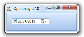
Another Windows Common Control exposed by OpenInsight 10 is the Date and Time Picker (DTP) control. This presents a simple interface for a user to enter date and/or time information in a standard or custom format. It also provides an option to display a drop-down calendar for picking a date.
It supports the following properties:
- CALALIGN
- CALBACKCOLOR
- CALFONT
- CALFORECOLOR
- CALMONTHBACKCOLOR
- CALTITLEBACKCOLOR
- CALTITLEFORECOLOR
- CALTRAILINGFORECOLOR
- CHECK
- CHECKBOX
- CUSTOMFORMAT
- FORMAT
- IDEALSIZE
- MAXVALUE
- MINVALUE
- UPDOWN
- VALUE
It supports the following method:
- CLOSECAL
And the following events:
- CHAR
- CHANGED
- CLOSEUP
- DROPDOWN
- GOTFOCUS
- LOSTFOCUS
CALALIGN property
This property controls the alignment of the drop-down calendar and can be one of the following values:
- “L” (Left – the default)
- “R” (Right)
CALBACKCOLOR property
This property is an RGB color value that specifies the background color displayed between months of the drop-down calendar. Setting this property has no effect if visual styles are enabled.
CALFONT property
This property specifies the font of the drop-down calendar – it has the same structure as the regular OpenInsight FONT property. Setting this property has no effect if visual styles are enabled.
CALFORECOLOR property
This property is an RGB color value that specifies the text color of the drop-down calendar. Setting this property has no effect if visual styles are enabled.
CALMONTHBACKCOLOR property
This property is an RGB color value that specifies the background color displayed within the month of the drop-down calendar. Setting this property has no effect if visual styles are enabled.
CALTITLEBACKCOLOR property
This property is an RGB color value that specifies the background color displayed in the title of the drop-down calendar. Setting this property has no effect if visual styles are enabled.
CALTITLEFORECOLOR property
This property is an RGB color value that specifies the text color displayed in the title of the drop-down calendar. Setting this property has no effect if visual styles are enabled.
CALTRAILINGFORECOLOR property
This property is an RGB color value that specifies the text color used to display the header day and trailing day text in the drop-down calendar. Setting this property has no effect if visual styles are enabled.
CHECK property
This is a boolean value that specifies if the DTP checkbox is ticked. It only applies if the DTP control contains a checkbox (see the CHECKBOX property below).
CHECKBOX property
This is a boolean value that specifies if a checkbox is shown within the DTP control. Normally the DTP control always contains a date/time value (i.e. it is never considered empty). However if a checkbox is shown then it is only considered to contain a valid date/time if the checkbox is ticked (see the CHECK property above).
CUSTOMFORMAT property
By default the format of the date and time displayed by the DTP control is one of the standard formats as defined in the user’s Windows environment settings:
The FORMAT property (see below) can be used to specify one of these.
However, it is possible to use a custom format and this can be set using either a standard Windows format string or a standard Revelation Date and Time IConv/Oconv format (“D”, “DT” and “MT”) which sets the underlying Windows format appropriately.
e.g. “D4/E” will be translated to “dd/MM/yyyy” and so on.
FORMAT property
This property specifies the format of the date and time displayed in the control and can be one of the following values:
- “0” – Custom format (set when using the CUSTOMFORMAT property – don’t set this yourself!)
- “1” – Windows Long Date format
- “2” – Windows Short Date format
- “3” – Windows Time format
IDEALSIZE property
This get-only property returns the size needed to display the control without any clipping as an @fm-delimited array:
<1> Ideal width in pixels
<2> Ideal height in pixels
MAXVALUE property
Specifies the maximum date and time that can be entered in the control. This is a standard Revelation DateTime format of:
<date> : "." : <time>
Where date is the number of days elapsed since 31/12/1967, and time is the fraction (percentage) of the day that has elapsed.
MINVALUE property
Specifies the minimum date and time that can be entered in the control. This is a standard Revelation DateTime format of:
<date> : "." : <time>
Where date is the number of days elapsed since 31/12/1967, and time is the fraction (percentage) of the day that has elapsed.
UPDOWN property
By default the DTP control displays a button to access a drop-down month calendar for modifying the date. Setting this property to TRUE (“1”) displays a Windows UpDown control to modify date-time values instead.
VALUE property
This property specifies the current value of the DTP control in the standard Revelation DateTime format of:
<date> : "." : <time>
Where date is the number of days elapsed since 31/12/1967, and time is the fraction (percentage) of the day that has elapsed.
While the TEXT property is supported the VALUE property should be used to access the DTP date-time values to avoid possible complications with custom formatting strings.
CLOSECAL method
This method simply closes a dropped-down month calendar. It takes no arguments.
call exec_Method( ctrlEntID, "CLOSECAL" )
Further reading
More information on the Date and Time Picker control can be found on the MSDN site here,
(Disclaimer: This article is based on preliminary information and may be subject to change in the final release version of OpenInsight 10).


