Perhaps one of the controls most in need of a face-lift in OpenInsight is the Button (a.k.a PUSHBUTTON) control, and in this post we’ll take a look at some of the new features we’ve added to it for version 10.
Image API
Buttons in OpenInsight have always supported background images and version 10 is no different. However we’ve extended the number of image states from 6 to 10 to give you a few more options if you want to use them:
- Up
- Down
- Disabled
- <not used>
- Up with focus
- Down with Focus
- Hot
- Hot with focus
- Default
- Default with focus
Of course you don’t have to supply all of these images – the system will attempt to pick the closest match based on the IMAGECOUNT supplied. Access to the image properties is exposed via the normal Image API with the exception of the IMAGENUMBER property which is managed automatically depending on the button state.
Glyph API
One of the biggest drawbacks with using buttons in previous versions of OpenInsight is that images have only ever been applied to the background as a whole. In order to create a button with an icon (or glyph, as we’ll refer to it henceforth) it has always been necessary to provide an image file with the entire button background drawn on it as well as the required glyph and text. This makes it very difficult to provide a solution that looks good across different color schemes and visual styles, and it also makes any sort of runtime customization problematic too.
For version 10 a new API has been added for buttons called the “Glyph API”. This allows you to specify an image for the button that is drawn on top of the normal background like so:

Classic-style button with glyph

XP-style button with glyph

Aero-style button with glyph

Windows 8-style button with glyph
It is exposed via the following properties:
- GLYPH (similar to the BITMAP or IMAGE property)
- GLYPHALIGN
- GLYPHCOLORKEY
- GLYPHCOUNT
- GLYPHFRAMECOUNT
- GLYPHFRAMENUMBER
- GLYPHOFFSET
- GLYPHORIGIN
- GLYPHLAYOUT
- GLYPHSPACING
- GLYPHSIZE
- GLYPHTRANSLUCENCY
These properties are very similar to their counterparts in the normal Image API with the exception of the following Button-glyph specific ones:
GLYPHLAYOUT property
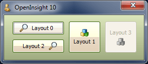
This property specifies how the glyph is laid out in relation to the text, and can be one of the following values:
- “0” – Glyph to the left, text to the right
- “1” – Glyph to the top, text to the bottom
- “2” – Glyph to the right, text to the left
- “3” – Glyph to the bottom, text to the top.

Aero-style buttons showing glyph layouts
GLYPHSPACING property
This property is simply the number of pixels between the glyph and the text.
Where’s the GLYPHNUMBER property?
Just as the Button Image API has no IMAGENUMBER property there is no corresponding GLYPHNUMBER property either – this is because you can provide more than one image for a glyph and the system will automatically select one for you based on the button state (just like with background images). These states are:
- Button up
- Button down
- Button disabled
- Button hot
- Button default
Note that if you don’t supply a disabled Glyph image and you disable the button the system will draw a grayed version of the glyph for you:
Aero-style buttons with system-drawn disabled glyph
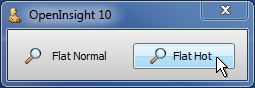
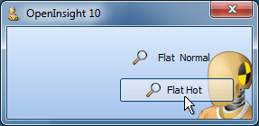
Flat buttons
Flat “toolbar” style buttons are supported by the boolean FLAT property. I.e. the actual background is not painted until the mouse is moved over the button.
Aero-style flat button
Aero-style flat buttons with 50% translucency
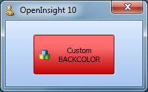
Custom colors
The button BACKCOLOR property fully supports custom colors and generates a set of matching 3D highlight and shadow colors to use when rendering.

XP-style button with red BACKCOLOR
The FORECOLOR property also makes a welcome return and is now respected regardless of the visual style in use.

Aero-style button with red FORECOLOR
Extended mouse support
Like the updated Label control the Button now supports the following new properties when the button is in the “hot” state (i.e. the mouse is moving over it):
- HOTFONT
- HOTFORECOLOR
- HOTBACKCOLOR
It also supports the new MOUSEOVER event so you can easily track mouse movements without having to resort to using WINMSG events.
Text Alignment and position
A TEXTORIGIN property is provided that allows you to specify the exact XY position that you wish the text to be drawn at in a similar manner to the GLYPHORIGIN property. Horizontal text alignment is also supported by the TEXTALIGN property.
(Disclaimer: This article is based on preliminary information and may be subject to change in the final release version of OpenInsight 10).


 Building OpenInsight 11