Tag Archives: ToolTips

Listboxes and ToolTips

Following on from our previous post on the new TOOLTIP property, this time we’re going to look at the new tooltip functionality added to Listbox controls, namely tracking and in-place item tooltips.

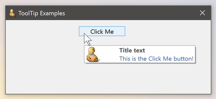
Tracking tooltips are small popup windows that appear when a user hovers over a partially obscured item in the control: they display the full item text string instead, and thereby avoid the need for horizontal scrolling, which is always a preferable user experience.

listbox_tracking_tooltips

Offset tracking tooltip

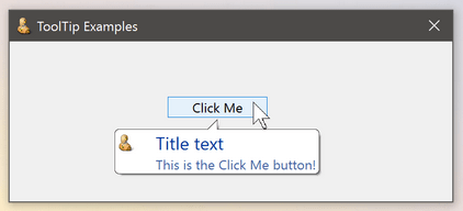
In-place tooltips operate in a similar manner, but rather than appearing at an offset to the cursor position they actually appear over the item itself, hence the term “in-place”:

listbox_inplace_tooltips

In-place tracking tooltip

This behaviour is controlled by the new SHOWITEMTOOLTIPS property which can be set to one of the following values:

  "0" - Disabled : Item tooltips are not displayed
  "1" - Offset   : Item tooltips are displayed at an offset to the cursor
  "2" - In-place : Item tooltips are displayed over the item itself.

When set to “1” (Offset) or “2” (In-place) the SHOWITEMTOOLTIPS property overrides the normal TOOLTIP property, so a “normal” tooltip will not be displayed.

Displaying alternative item text

Sometimes it is desirable to display a different text string in the tooltip rather than the item text itself.  In this case you can set the new SHOWVALUESASTOOLTIPS property to specify that the tooltip should display the contents of the item’s VALUE property instead.

SHOWVALUESASTOOLTIPS is a simple boolean property of TRUE$ or FALSE$.

listbox_tracking_value_tooltips

Displaying the Value property as a tooltip

Note in this case the tooltip is always displayed at an offset, and is triggered regardess of whether or not the item is clipped.


Combobox and TreeListbox controls

Both new properties described here also apply to simple Combobox and TreeListbox controls.

(Disclaimer: This article is based on preliminary information and may be subject to change in the final release version of OpenInsight 10).


TOOLTIP is the new HELPTEXT

A tooltip is a small pop-up window that describes a control being pointed to, usually referred to as a “tool”, and they are commonly used to provide labelling for controls that only display an image, such as toolbar buttons.

Simple tooltip

Simple tooltip

Earlier versions of OpenInsight supported some basic tooltip functionality for a very limited set of controls via the HELPTEXT property, but for version 10 the name HELPTEXT has been deprecated for all standard controls (i.e. for objects other than menu items) and renamed to TOOLTIP instead, thereby bringing it in line with standard Windows terminology.  The name HELPTEXT can still be used however, to preserve backwards compatibility with your existing code.

Unlike in previous versions the new TOOLTIP property is not a single string, because there are more attributes that can be set – It is now an @fm-delimited dynamic array structured as follows:

   <1> Text
   <2> Title
   <3> Icon
   <4> Large Icon
   <5> Balloon Style
   <6> Centered

Text

This is the text to display.  Multiple lines are delimited by @tm.  This attribute is required for the tooltip to be displayed.

Tooltip with multiple lines

Tooltip with multiple lines

Title

This is the title to display in the tooltip. This is an optional attribute.

Tooltip with title

Tooltip with title

Icon

This attribute is only valid if the Title attribute is set.  It should contain the name of an icon file or resource to display in the tooltip (as per the usual ICON property).  Alternatively you can pass one of the following special characters to use a standard Windows icon instead (in a similar manner to the Msg() function):

  • “*” – Use the standard Information icon
  • “!” – Use the standard Warning icon
  • “H” – Use the standard Error icon
Tooltip with icon

Tooltip with icon

Large Icon

Normally the tooltip uses a 16×16 pixel size icon.  When this attribute is set to TRUE$ the tooltip will use a 32×32 pixel size one instead.  The default value is FALSE$.

Tooltip with large icon

Tooltip with large icon

Balloon Style

Standard tooltips use a rectangle shape when they are displayed. When this attribute is set to TRUE$ a “balloon” shape is used instead, with a stem pointing to the owning tool.  The default value is FALSE$.

Balloon style tooltip

Balloon style tooltip

Centered

Tooltips normally display themselves at an offset to their tool – when this attribute is set to TRUE$ the tooltip is centered underneath the tool instead.  The default value is FALSE$.

Tooltip with center-style

Tooltip with center-style

Basic+ example:

   // Example: display a multiline balloon tooltip containing a warning icon 
   // and title for a static control called TXT_ALERT

   declare function rti_ErrorText
   $insert ps_Tooltip_Equates
   $insert logical

   tooltip = ""
   tooltip<PS_TOOLTIP_POS_TEXT$>    = rti_ErrorText( "SP", errorCodes )
   tooltip<PS_TOOLTIP_POS_TITLE$>   = "Woeful tidings"
   tooltip<PS_TOOLTIP_POS_ICON$>    = PS_TOOLTIP_ICON_WARNING$  ; // "!"
   tooltip<PS_TOOLTIP_POS_BALLOON$> = TRUE$

   call set_Property_Only( @window : ".TXT_ALERT", "TOOLTIP", tooltip )

The TOOLTIP property applies to all controls except OLE controls, as these usually provide their own tooltips.  Some controls, such as List Box and Toolbar controls, also support different types of tooltips such as in-place and tracking, and these will be described in a future post.

(Disclaimer: This article is based on preliminary information and may be subject to change in the final release version of OpenInsight 10).