Tag Archives: Images

Screenshots with the CAPTUREIMAGE method

Bitmap controls in OpenInsight 10 have a method called CAPTUREIMAGE, which allows you to “screenshot” the contents of another OI control or form into the Bitmap control’s IMAGE sub-object. As you can see, it has a very simple interface:

SuccessFlag = Exec_Method( BitMapCtrlID, "CAPTUREIMAGE", CaptureID )

Where “CaptureID” is the fully qualified name of the control to screenshot.

E.g.

If we have a form called TEST_CAPTUREIMAGE, with a BITMAP control called BMP_SCREENSHOT, then we can screenshot the contents of the IDE into it like so:

Call Exec_Method( "TEST_CAPTUREIMAGE.BMP_SCREENSHOT", "CAPTUREIMAGE", |
                   "RTI_IDE" )
Shows a captured image of the OpenInsight IDE in a Bitmap control.

(N.B. The captured image you see displayed above is scaled – the screenshot is stored at full resolution in the control itself)

One obvious use for this is for support purposes, e.g:

  • Take a screen-shot with CAPTUREIMAGE.
  • Use The SAVETOFILE method in the IMAGE API to save it to a file.
  • Create an email message with the image file attached or embedded and send it to your support desk.

We’re sure you can think of more.

Bonus trivia:

  • CAPTUREIMAGE works with any object that supports the Windows WM_PRINTCLIENT message.
  • BITMAP controls are basically an alias for STATIC controls, so all STATIC controls support this method.

The IMAGE Object API (Redux)

Once upon a time, in a blog post far far away, we looked at a very early incarnation of the version 10 Image API which described how images were used with OpenInsight forms and controls. Since then the API has changed quite a bit, so this post gives you a PDF link to a preview of the API documentation which covers the capabilities in the next release, some of which hasn’t been described before.

An overview of the Image API

Many GUI types managed by the Presentation Server support images in one form or another; some have background images, some have glyphs, some have image lists and so on. However, many of these images have properties of their own, and in most cases these image properties are common to all.

Because of this most Presentation Server types that support images expose them as intrinsic “sub-objects”, thorough a model we refer to as the “Image Object API”. The image object’s lifetime is managed by the system and it cannot be programmatically destroyed from Basic+, but it can be manipulated by the Get/Set_Property and Exec_Method functions just like any other Presentation Server object.

The entire Image API is described in the linked PDF below but be aware that not all image objects support all of the API. For example, a PUSHBUTTON type does not support an “INDEX” property for its background image, and its SplitGlyph image doesn’t support an ALIGN property: All such exceptions are documented in the relevant sections that describe each object type.

Supported image types

The Presentation Server supports the following image types via the WIC (Windows Imaging Component) sub-sytem:

  • BMP
  • ICO
  • PNG
  • GIF
  • JPEG
  • TIFF

Image Object Properties

NameDescription
ALIGNSpecifies the horizontal and vertical alignment of the image
within its parent.
AUTOSCALESpecifies if the image should be scaled along with its parent
object.
COLORKEYSpecifies the color in the image that should be treated as the
“transparent color”.
COUNTSpecifies the number of sub-images within an image file.
FILENAMEReturns the name of the image file being displayed.
FILENAMESSpecifies an array of DPI-specific image files to display.
FRAMECOUNTReturns the number of “frames” within an image.
FRAMEDELAYReturns the delay time in milliseconds for a multi-frame image.
FRAMEINDEXSpecifies the frame to display within a multi-frame image.
INDEXSpecifies the index of the sub-image to display within a multiimage file.
OFFSETSpecifies the point within the image (not the object) to begin
drawing from.
ORIGINSpecifies the point within the object (not the image) to begin
drawing from.
SIZEReturns the width and height of the image in pixels
STYLESpecifies how the image is drawn into an object (Tiled,
Stretched, Clipped or Scaled).
TRANSLUCENCYSpecifies the degree of transparency applied to an image when
it is drawn

Image Object Methods

NameDescription
SAVETOFILESaves the current image to a file.
SETHBITMAPLoads an image from a Windows BITMAP handle (HBITMAP).
SETIMAGELoads an image from an array of “raw” image bytes.
SETREPOSIMAGESpecifies the image file(s) using an OpenInsight repository
IMAGE entity.

Here’s the link to the Image Object API PDF – adding animated GIFs to your applications has never been so easy!

The SCALEFACTOR property

As we mentioned in our last post on High-DPI, the work needed to accommodate per-monitor DPI scaling in Windows 8.1 has also created the ability to scale OpenInsight forms to an arbitrary value outside of any system DPI settings.  This new functionality is exposed via the SCALEFACTOR property described below.

SCALEFACTOR property

This WINDOW property is a dynamic array comprising four fields:

<1> ScaleFactor
<2> Minimum ScaleFactor
<3> Maximum ScaleFactor
<4> ScaleFactor Increment

<1> ScaleFactor

This is a number that specifies how much to scale the form by.  A value of 1 means that the form has no scaling applied, a value of 1.5 scales the form to one-and-a-half times its normal size and so on.

Note that the scale factor is applied after any scaling applied for system DPI.  So, if your form runs on a 144 DPI monitor (150%) and has a scalefactor of 2 applied the actual scalefactor used is 3.0 (1.5 x 2.0).

<2> Minimum ScaleFactor

This specifies the minimum value that the ScaleFactor can be set to. By default it is set to “0.1”.  This value can be set at design time. See the note on “Scaling Restrictions” below.

<3> Maximum ScaleFactor

This specifies the maximum value that the ScaleFactor can be set to. By default it is set to “5.0”.  This value can be set at design time. See the note on “Scaling Restrictions” below.

<4> ScaleFactor Increment

If this field is set to a value other than 0 it allows the ScaleFactor to be adjusted via the  Mouse-wheel /Ctrl-key combination, or with a “pinch-zoom” gesture if running under a touch screen.  The increment value controls the rate at which the form grows or shrinks.  This value can be set at design time.

Example 1: Set a form’s scale to twice its designed size while allowing the user to adjust the scalefactor by the mouse or touchscreen:

* // Note that we ignore the min and max scalefactors, leaving them at their
* // defaults.
scaleFactor = ""
scaleFactor<1> = 2    ; * // twice normal size
scaleFactor<4> = 0.1  ; * // allow mousewheel/gesture - each wheel notch
                      ; * // adjusts the scalefactor by 0.1

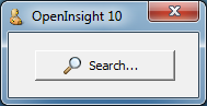
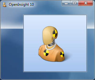
Example 2: Comparing OpenInsight forms with a SCALEFACTOR of 0.5 and 1.0 respectively (both running on a 144 DPI desktop with DPISCALING disabled)

Comparing SCALEFACTOR 0.5 vs 1.0

Comparing SCALEFACTOR 0.5 vs 1.0

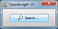
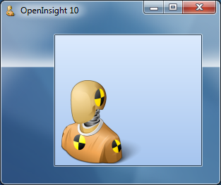
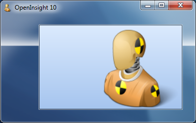
Example 3: Comparing OpenInsight forms with a SCALEFACTOR of 1.0 and 1.7 respectively (both running on a 144 DPI desktop with DPISCALING disabled)

Comparing SCALEFACTOR 1.0 vs 1.7

Comparing SCALEFACTOR 1.0 vs 1.7

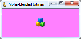
DPI Image Lists and Image Scaling

In Example 3 above note the quality of the magnifying glass glyph on the buttons in the scaled form: it is much clearer and sharper on the Search button than it is on the Split button. This is because the Search button was designed using a “DPI Image List”, which means that an array of images, along with a corresponding array of DPI values, was specified for this glyph rather than just a single image. OpenInsight scans this DPI Image List looking for the closest match it can find when performing a scaling operation.  By contrast the Split button is using a single image designed for 96 DPI and stretched to fit, resulting in a blurry appearance.

(Note: We first mentioned this functionality in the section “Supporting images under High-DPI” in our original High-DPI post).

Or course, you may also find yourself in the position of not wanting a particular image scaled, and in this case we’ve added a new property to the Image API called IMAGEAUTOSCALE.  This is a simple boolean property that controls if an image is scaled by the system during the scaling process.  It’s default value is TRUE.

(We’ve also added a similar property to other areas of the system that use images as well, so there is a GLYPHAUTOSCALE property, a SPLITGLYPHAUTOSCALE property and so on).


Scaling Restrictions

The minimum and maximum size that a form can be rescaled to can be restricted by the minimum and maximum window sizes as defined by the OS.  As a general rule this size is usually slightly larger than the size of the entire desktop across all monitors (See the GetSystemMetrics() Windows API function along with the indexes SM_CXMAXTRACK, SM_CXMINTRACK, SM_CYMAXTRACK, and SM_CYMINTRACK for more details).

You can, however, override this behaviour if you set the TRACKINGSIZE property for a form, specifying values large enough to handle your desired scaling range.

 * // Example - Ensure the form will actually scale to the min and max factors
 * //           we've set
 
 winSize     = get_Property( @window, "SIZE" )
 scaleFactor = get_Property( @window, "SCALEFACTOR" )
 
 trackingSize    = ""
 trackingSize<1> = winSize<3> * scaleFactor<2>
 trackingSize<2> = winSize<4> * scaleFactor<2>
 trackingSize<3> = winSize<3> * scaleFactor<3>
 trackingSize<4> = winSize<4> * scaleFactor<3>
 
 call set_Property( @window, "TRACKINGSIZE", trackingSize )


Scaling Interaction

In our next post we’ll take a look at the new SCALED event and discuss how to interact with the system during a scaling operation.

(Disclaimer: This article is based on preliminary information and may be subject to change in the final release version of OpenInsight 10).

Edit controls and the Image API

In a previous post we mentioned that the EditLine control now supports the Glyph API, we’ve also extended the Image API to both EditLines and EditBoxes, along with gradient background colors and translucency.  Here are a few examples showing the results:

Gradient BACKCOLOR

EDIT Control with Gradient BACKCOLOR

EDIT Control with Gradient BACKCOLOR

TRANSLUCENCY Property

EDIT Control with TRANSLUCENCY of 50

EDIT Control with TRANSLUCENCY of 50

IMAGE Property

EDIT Control with background image

EDIT Control with background image

IMAGETRANSLUCENCY Property

EDIT Control with translucent background image

EDIT Control with translucent background image


(Disclaimer: This article is based on preliminary information and may be subject to change in the final release version of OpenInsight 10).

Button controls

Perhaps one of the controls most in need of a face-lift in OpenInsight is the Button (a.k.a PUSHBUTTON) control, and in this post we’ll take a look at some of the new features we’ve added to it for version 10.

Image API

Buttons in OpenInsight have always supported background images and version 10 is no different.  However we’ve extended the number of image states from 6 to 10 to give you a few more options if you want to use them:

  1. Up
  2. Down
  3. Disabled
  4. <not used>
  5. Up with focus
  6. Down with Focus
  7. Hot
  8. Hot with focus
  9. Default
  10. Default with focus

Of course you don’t have to supply all of these images – the system will attempt to pick the closest match based on the IMAGECOUNT supplied.  Access to the image properties is exposed via the normal Image API with the exception of the IMAGENUMBER property which is managed automatically depending on the button state.

Glyph API

One of the biggest drawbacks with using buttons in previous versions of OpenInsight is that images have only ever been applied to the background as a whole.  In order to create a button with an icon (or glyph, as we’ll refer to it henceforth) it has always been necessary to provide an image file with the entire button background drawn on it as well as the required glyph and text.  This makes it very difficult to provide a solution that looks good across different color schemes and visual styles, and it also makes any sort of runtime customization problematic too.

For version 10 a new API has been added for buttons called the “Glyph API”. This allows you to specify an image for the button that is drawn on top of the normal background like so:

Classic-style button with glyph

Classic-style button with glyph

XP-style button with glyph

XP-style button with glyph

Aero-style button with glyph

Aero-style button with glyph

Win8-style button with glyph

Windows 8-style button with glyph

It is exposed via the following properties:

  • GLYPH (similar to the BITMAP or IMAGE property)
  • GLYPHALIGN
  • GLYPHCOLORKEY
  • GLYPHCOUNT
  • GLYPHFRAMECOUNT
  • GLYPHFRAMENUMBER
  • GLYPHOFFSET
  • GLYPHORIGIN
  • GLYPHLAYOUT
  • GLYPHSPACING
  • GLYPHSIZE
  • GLYPHTRANSLUCENCY

These properties are very similar to their counterparts in the normal Image API with the exception of the following Button-glyph specific ones:

GLYPHLAYOUT property

This property specifies how the glyph is laid out in relation to the text, and can be one of the following values:

  • “0” – Glyph to the left, text to the right
  • “1” – Glyph to the top, text to the bottom
  • “2” – Glyph to the right, text to the left
  • “3” – Glyph to the bottom, text to the top.

Buttons showing  glyph layouts

Aero-style buttons showing glyph layouts

GLYPHSPACING property

This property is simply the number of pixels between the glyph and the text.

Where’s the GLYPHNUMBER property?

Just as the Button Image API has no IMAGENUMBER property there is no corresponding GLYPHNUMBER property either – this is because you can provide more than one image for a glyph and the system will automatically select one for you based on the button state (just like with background images).  These states are:

  1. Button up
  2. Button down
  3. Button disabled
  4. Button hot
  5. Button default

Note that if you don’t supply a disabled Glyph image and you disable the button the system will draw a grayed version of the glyph for you:

Button with disabled glyph

Aero-style buttons with system-drawn disabled glyph

Flat buttons

Flat “toolbar” style buttons are supported by the boolean FLAT property.  I.e. the actual background is not painted until the mouse is moved over the button.

Flat button

Aero-style flat button

Flat button with translucency

Aero-style flat buttons with 50% translucency

Custom colors

The button BACKCOLOR property fully supports custom colors and generates a set of matching 3D highlight and shadow colors to use when rendering.

Button with red BACKCOLOR

XP-style button with red BACKCOLOR

The FORECOLOR property also makes a welcome return and is now respected regardless of the visual style in use.

Button with red FORECOLOR

Aero-style button with red FORECOLOR

Extended mouse support

Like the updated Label control the Button now supports the following new properties when the button is in the “hot” state (i.e. the mouse is moving over it):

  • HOTFONT
  • HOTFORECOLOR
  • HOTBACKCOLOR

It also supports the new MOUSEOVER event so you can easily track mouse movements without having to resort to using WINMSG events.

Text Alignment and position

TEXTORIGIN property is provided that allows you to specify the exact XY position that you wish the text to be drawn at in a similar manner to the GLYPHORIGIN property.  Horizontal text alignment is also supported by the TEXTALIGN property.

(Disclaimer: This article is based on preliminary information and may be subject to change in the final release version of OpenInsight 10).

Label controls

Over the past few posts we’ve taken a look at some of the new controls we’ve added to OpenInsight in version 10, but during the development process we’ve also taken the opportunity to upgrade some of the existing controls as well.  In this post we’ll take a look at the humble Label (or STATIC) control and examine some of the new features that have been implemented for it.

Background Images

The Label control now exposes the full Image API in the same way as the version 10 OpenInsight WINDOW object does.

Label control with background image

Label control with background image

Gradient background colors

The BACKCOLOR property now supports gradients in the same way that the current OpenInsight WINDOW object does, along with the associated GRADIENTSTYLE property.

Label control with gradient background

Label control with gradient background

Translucent background

The Label control may use a translucent background via the TRANSLUCENCY property.

Label control with translucent background

Label control with translucent background

Aero Glass support

As part of OpenInsight’s Aero Glass support, transparent labels drawn on glass in Vista and Windows 7 have the recommended “glow effect” enabled to improve readability:

Label controls on Aero Glass

Transparent Label controls on Aero Glass

Text Alignment

Vertical as well as horizontal text alignment is now supported via the TEXTALIGN property:

  • “0” Top-Left
  • “1″ Top-Center
  • “2″ Top-Right
  • “3″ Middle-Left
  • “4″ Centered
  • “5″ Middle-Right
  • “6″ Bottom-Left
  • “7″ Bottom-Center
  • “8″ Bottom-Right

Label control with bottom-center text alignment

Label control with bottom-center text alignment

A TEXTORIGIN property is also exposed that allows you to specify the exact XY position that you wish the text to be drawn at in a similar manner to the standard IMAGEORIGIN property.

Mouse-over support

Label controls can now respond to a mouse-over or “hot” state via the new HOTFORECOLOR, HOTFONT and HOTBACKCOLOR properties.  When set these properties are used in place of their standard counterparts (FORECOLOR, FONT and BACKCOLOR) when the mouse is over the control.

Mouse event support

The following standard events are now exposed for Label controls:

  • CLICK
  • DBLCLK

In addition to this we’ve also provided a new MOUSEOVER event along with a notification flag for when the mouse enters and exits a control (We intend to extend the MOUSEOVER event to cover all OpenInsight controls).

Edge styling

By default normal Windows Label controls actually support a “edge-style” that allows them to have a sunken or etched border, or even display themselves as a single vertical or horizontal etched line.  Although this capability can be used in earlier versions of OpenInsight via raw style-bit manipulation we’ve exposed it fully in Version 10 via the EDGESTYLE property.  This can be one of the following values:

  • “0” – No border
  • “1” – Sunken border
  • “2” – Etched Horizontal line along the top edge
  • “3” – Etched Vertical line along the left edge
  • “4” – Etched Frame

Label control with a sunken border

Label control with a sunken border

Label control with an etched frame

Label control with an etched frame

Text handling

We’ve exposed a couple of new text handling properties: AUTOELLIPSES and WORDWRAP.  The former allows truncated text to be suffixed with the ellipses string  “…”, while the latter allows text to wrap in an effort to avoid truncation where possible.

Label control with AUTOELLIPSES enabled

Label control with AUTOELLIPSES enabled

HTML Text rendering

The Label control now supports simple inline HTML rendering via the boolean DRAWHTML property.  The following tags are currently supported:

  • <b>Bold</b>
  • <i>Italic</i>
  • <u>Underline</u>
  • <strike>Strikeout</strike>
  • <sub>Subscript</sub>
  • <sup>SuperScript</sup>
  • <font>Font</font>
  • <br>

The font tag supports the following attributes:

  • color
  • bgcolor
  • face
  • size

Label control with HTML text rendering

Label control with HTML text rendering

 (As with the aforementioned MOUSEOVER support we’re intending to extend HTML text rendering to other controls where appropriate)

(Disclaimer: This article is based on preliminary information and may be subject to change in the final release version of OpenInsight 10).

The Image API

As promised in our last post this time we’re going to cover the new properties we’ve added to the Presentation Server to support the enhanced image capability:

  • IMAGEALIGN
  • IMAGECOLORKEY
  • IMAGEFRAMECOUNT
  • IMAGEFRAMENUMBER
  • IMAGESIZE
  • IMAGESTYLE
  • IMAGETRANSLUCENCY

We have also added the following new method:

  • SETIMAGE

IMAGEALIGN property

This property specifies how a clipped or scaled image is aligned within a client area.  It can be one of the following values:

  • “0” Top-Left
  • “1” Top-Center
  • “2” Top-Right
  • “3” Middle-Left
  • “4” Centered
  • “5” Middle-Right
  • “6” Bottom-Left
  • “7” Bottom-Center
  • “8” Bottom-Right

Examples:

IMAGEALIGN 4 (Centered)

IMAGEALIGN 6 (Bottom-Left)

IMAGEALIGN 6 (Bottom-Left)

IMAGESTYLE property

This property specifies how the image is rendered onto the window’s client area.  The following property values are supported:

  • “0” Clip – the image is not resized and is simply rendered onto the client area according to the IMAGEALIGN property (Note that the IMAGEORIGIN property will override the image alignment).
  • “1” Stretch – the image is resized to cover the entire client area of the window.
  • “2” Tile – the image is tiled across the entire client area.
  • “3” Scale – the image is resized but it’s proportions are kept constant: e.g. if the image is taller than it is wide the image height will be resized to the height of the client area, and it’s width scaled to keep the same proportions.  It will also respect the IMAGEALIGN property.

Examples:

IMAGESTYLE 1 (Tiled)

IMAGESTYLE 1 (Tiled)

IMAGESTYLE 2 (Stretched)

IMAGESTYLE 2 (Stretched)

IMAGESTYLE 3 (Scaled), IMAGEALIGN 5 (Center-Right)

IMAGESTYLE 3 (Scaled), IMAGEALIGN 5 (Center-Right)

IMAGECOLORKEY property

This property specifies the color to use as the transparent color when rendering the image as described in this post.  It basically replaces the current (and undocumented) IMAGETRANSPARENT and TRANSPARENTCOLOR properties, both of which have been deprecated with this release.

This property should be a valid RGB color value or one of the following special values:

  • “-1” Use the color of the top left pixel as the color-key.
  • “-2” Use the color of the top-right pixel as the color-key.
  • “-3” Use the color of the bottom-left pixel as the color-key.
  • “-4” Use the color of the bottom-right pixel as the color-key.
  • “-5” Do not use any color-keying.

IMAGEFRAMECOUNT property

Some image formats such a GIF and TIFF files can contain more than one image, held in series of frames.  This read-only property returns the number of frames in the image file.  Note that this is not the same as the IMAGECOUNT property, which applies to a single frame only.

Example:

Animated GIF with 12 frames

Animated GIF with 12 frames

IMAGEFRAMENUMBER property

This property gets or sets the current display frame for the image and could be used with a TIMER event to display an animated GIF file for example.  Note that this property is not the same as the IMAGENUMBER property which applies to a single frame only.

Examples:

Animated GIF with IMAGEFRAMENUMBER of 2

Animated GIF with IMAGEFRAMENUMBER of 2

Animated GIF with IMAGEFRAMENUMBER of 10

Animated GIF with IMAGEFRAMENUMBER of 10

IMAGESIZE property

This read-only property returns a dynamic array containing the size of the image in pixels:

<1> Width
<2> Height

Note that for a multi-frame image format it returns the size of a single frame, not all the frames combined.

IMAGETRANSLUCENCY property

This property specifies the transparency of the entire image as it is rendered onto the window. It is based on simple percentage amount, “0″ being fully opaque and “100″ being fully transparent (and therefore not visible).

Example:

IMAGETRANSLUCENCY of 70 with IMAGEORIGIN of 90,60

IMAGETRANSLUCENCY of 70 with IMAGEORIGIN of 90,60

SETIMAGE method

This method supersedes the existing IMAGE property and allows a image to be set by passing the raw image data rather than by passing a file or resource name as per the BITMAP property.  The OpenInsight property interface is text-based and does not support passing binary data with embedded null characters, whereas the method interface does, hence the reason for this change.

Other image-related properties

The following current image-related properties remain the same:

  • BITMAP
  • IMAGECOUNT
  • IMAGENUMBER
  • IMAGEOFFSET
  • IMAGEORIGIN

Deprecated properties

The following properties have been deprecated or removed in OpenInsight 10:

  • IMAGE – this property has been superseded by the SETIMAGE method.  It is now a synonym for the BITMAP property.
  • IMAGECLIP – this property has been superseded by the IMAGESTYLE property.
  • IMAGETRANSPARENT – this property has been superseded by the IMAGECOLORKEY property.
  • TRANSPARENTCOLOR – this property has been superseded by the IMAGECOLORKEY property.

(Disclaimer: This article is based on preliminary information and may be subject to change in the final release version of OpenInsight 10).

Image transparency – Color-keying and Alpha-blending

Earlier versions of OpenInsight have supported basic image transparency via a method called “color-keying”, where a specific color in the image is nominated as the transparent color (by default the color of the top-left pixel).  When the image is drawn to screen the pixels that match the transparent color are not rendered so the background pixels show through instead.  Whilst this can be effective in simple cases it is sub-optimal for images that have smooth curves and shadows as these tend to appear very pixelated: You can see this in the example from OpenInsight 9.3 below, where a bitmap with a white background and a slight shadow is rendered to a non-white background:

Orignal bitmap

Color-Keyed bitmap showing pixelated edges

Color-Keyed bitmap showing pixelated edges

A much better alternative is to use an image format that supports an “alpha channel” such as a PNG file*. Basically this means that each pixel in the image has an extra byte that describes it’s transparency – a value of 0 means that the pixel is totally transparent, while a value of 255 means that the pixel is totally opaque, Values in between are used to calculate how the image pixel is combined with the background pixel when drawn, so that it gives the appearance of being translucent, allowing the background pixel to show through to some degree.  This is a technique known as Alpha-blending.

With version 10 we’ve taken the opportunity to re-visit OpenInsight’s image handling so it respects the alpha channel properly – you can see this in the example below, where the same image is loaded from a PNG file rather than a standard BMP file:

Alpha-blended source bitmap

Alpha-blended PNG bitmap with smooth edges and shadow

Alpha-blended PNG bitmap with smooth edges and shadow

We have also take this one step further and provided the ability to specify a transparency setting for the entire image when it is rendered, so you can create an effect like a watermark:

Alpha-blended translucent image on a gradient background

Alpha-blended translucent image on a gradient background

Note that this effect also applies to color-keyed and non-transparent bitmaps too, which of course are still fully supported so you won’t need to change your existing applications unless you want to. In the next post we’ll take a look at some of the new image-specific properties that support this functionality.

* (PNG image files have always been supported in OpenInsight but the alpha-channel has never been respected, thereby limiting them to basic color-keying for transparency effects).

(Disclaimer: This article is based on preliminary information and may be subject to change in the final release version of OpenInsight 10).

Image format support in OpenInsight 10

16-bit and 32-bit versions of OpenInsight have historically used a 3rd party library (ImageMan) for handling various image formats, mainly due to the lack of inbuilt support in Windows itself when the OpenInsight tool-set was first developed.

Unfortunately with the move to a 64-bit version of OpenInsight there is no 64-bit version of the ImageMan library available, but Windows itself now offers excellent image format support as part of the platform, so with version 10 we’ll be taking advantage of the WIC (Windows Imaging Component) libraries to provide support for the following popular formats:

      • BMP
      • GIF
      • ICO
      • JPG
      • PNG
      • TIFF

More information on the WIC can be found here.

(Disclaimer: This article is based on preliminary information and may be subject to change in the final release version of OpenInsight 10).