Monthly Archives: June 2016

BLen is the new GetByteSize

As one observant commenter noticed in our last post there’s a new Basic+ function called “BLen” in the version 10 compiler.  This is simply a synonym for the standard GetByteSize function, and was added to:

  1. Save me some typing effort (very important)
  2. Fit in with some of the other binary functions like BRemove and BCol2.

Of course, you may be wondering why GetByteSize/BLen is being used so much that I got tired of typing it?  It’s simply that as we progress through the v10 codebase we’re updating the code to be  “UTF8-safe” – i.e. we’re aiming to ensure that we don’t lose any performance when running in UTF8 mode, and a common Basic+ programming pattern for detecting a non-null variable is this:

   If Len( someVar ) Then
      // Variable is not null
   End

Variables in Basic+ are length-encoded, i.e. they cache the number of bytes that they occupy in memory.  When running in ANSI mode the Len statement simply returns this number (because 1-byte always equals 1 character) so if it’s zero you know you don’t have any data. However, because UTF8 is a multi-byte character-encoding format, the Len statement in UTF8-mode has to scan the contents of the entire variable to count the number of characters – it can’t use the cached byte-count.  This means that a simple check with Len could trigger this counting process when all you really want to know is if the variable contains data, and this could impact performance when dealing with large strings or arrays.

So, the best option is to use GetByteSize rather than Len, which always returns the cached byte-count regardless of ANSI or UTF8-mode, but as I don’t like typing very much you can now use BLen instead.

If you’re interested in writing UTF8-safe code and you’re not familiar with the Basic+ binary functions, you can find more details on them in a series of posts I wrote a few years ago on the Sprezzatura blog.  You may also want to check out the Internationalization section in the OI Coding Standards document too for some more UTF8-mode hints and tips.

(Disclaimer: This article is based on preliminary information and may be subject to change in the final release version of OpenInsight 10).



The FILEPREVIEW control

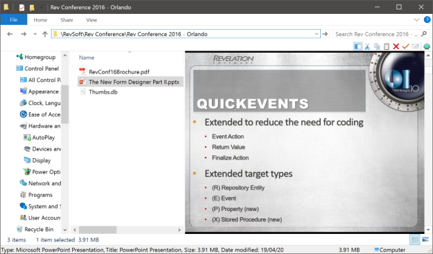
One of the new controls added to version 10 is the FILEPREVIEW control, which taps into the Windows Shell interface to expose the same  functionality provided by the Windows Explorer when previewing the contents of files, as per the example below:

explorer_preview

Windows Explorer PowerPoint preview

Using the FILEPREVIEW control is quite easy – simply set the FILENAME property with the name and path of the file you want to preview, and if the OS has handlers installed for that file type then the control will render them.

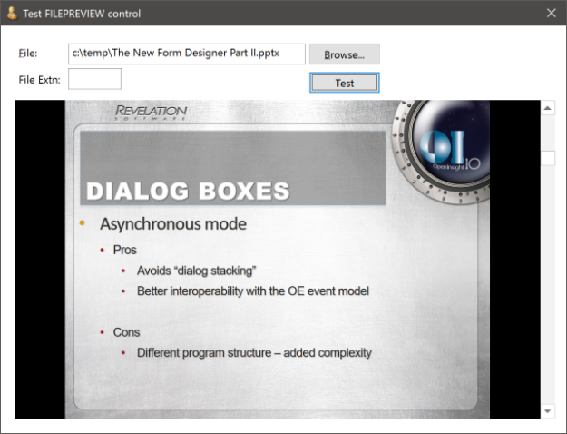
Here’s an example of previewing a PowerPoint file:

  fileName = get_Property( @window : ".EDL_FILENAME", "TEXT" )
  if bLen( fileName ) then
     call set_Property_Only( @window : ".FPV_VIEWER", "FILENAME", |
                             fileName )
  end
filepreview

FILEPREVIEW control example

The devil of course is in the details – your OS must have the correct handler DLLs installed for you to view the preview of the file, and this may rely on third party software being installed as well.  For example, to preview Word and Excel documents you must have Office installed, to preview PDF files you must have something like Adobe Reader installed and so on.  You can test for this at runtime by using the PREVIEWHANDLER method, which returns a GUID identifying the preview handler DLL if it is installed.  You simply pass the extension you wish to look up and check for a returned GUID like so:

  handlerGUID = exec_Method( previewCtrl, "PREVIEWHANDLER", "pdf" )
  if bLen( handlerGUID ) then
    // We have a PDF preview viewer on the workstation ...
    call set_Property_Only( previewCtrl, "FILENAME", "c:\temp\test.pdf" )
  end 

The control also supports an ACTIVE property which returns TRUE$ if the control currently has a file loaded for previewing.

(Disclaimer: This article is based on preliminary information and may be subject to change in the final release version of OpenInsight 10).


The AUTODROPDOWN property

One of the areas in which dropdown comboboxes have always been lacking is the ability to fully control when the list is populated in a visually pleasing manner.  Under most circumstances the contents are loaded well before the dropdown button is clicked, and this is fine, but in situations where the items are context -sensitive it is necessary to load them just before the list is shown, and in previous versions this can look a little messy.

You can see an example of this in the OI9 System Editor++: there is a very handy pair of dropdowns at the top if the form that allow you to navigate your source code using inserts and labels, but when you use them you see the list contents loaded just after it has been dropped; this looks somewhat jarring and usually causes issues with the vertical scrollbar too.

Of course, the reason for this is that OpenInsight events are normally fired in an asynchronous manner, and the DROPDOWN event won’t run until after the list has been shown.  While you do have the ability to fire events in a synchronous fashion, this can introduce other complications and is something that should be avoided whenever possible.

So, in order to fix this, OpenInsight 10 provides a new property called AUTODROPDOWN that allows the list to be loaded during the DROPDOWN event and then displayed precisely when needed.

AUTODROPDOWN is a boolean property and is set to TRUE$ by default.

  • When set to TRUE$ the combobox behaves in exactly the same way as previous versions.
  • When set to FALSE$, the list is not shown until you explicitly set the DROPDOWN property to TRUE$. This gives you ability to load the list contents and then show them when ready.

Here’s an example of loading a list of STPROC repository items in a DROPDOWN event when AUTODROPDOWN is FALSE$

  // Get a list of items
  reposIDs = get_Repos_Entities( "", "STPROC", "", FALSE$, |
                                 TRUE$, FALSE$, "" )
  
  // Load them into the combobox LIST property
  call set_Property_Only( ctrlEntID, "LIST", reposIDs )

  // Now show the list
  call set_Property_Only( ctrlEntID, "DROPDOWN", TRUE$ )

Comboboxes as options buttons?

Another area where AUTODROPDOWN may help is for systems that use comboboxes as a combined edit and options control, where clicking the dropdown button loads a dialog box or popup instead of dropping a list.  Again, in previous versions this tends to look a little crude because the combobox shows a very shallow list even though it is empty, but with AUTODROPDOWN set to FALSE$ the list is never shown, and consequently looks much better.

(Disclaimer: This article is based on preliminary information and may be subject to change in the final release version of OpenInsight 10).

Listboxes and ToolTips

Following on from our previous post on the new TOOLTIP property, this time we’re going to look at the new tooltip functionality added to Listbox controls, namely tracking and in-place item tooltips.

Tracking tooltips are small popup windows that appear when a user hovers over a partially obscured item in the control: they display the full item text string instead, and thereby avoid the need for horizontal scrolling, which is always a preferable user experience.

listbox_tracking_tooltips

Offset tracking tooltip

In-place tooltips operate in a similar manner, but rather than appearing at an offset to the cursor position they actually appear over the item itself, hence the term “in-place”:

listbox_inplace_tooltips

In-place tracking tooltip

This behaviour is controlled by the new SHOWITEMTOOLTIPS property which can be set to one of the following values:

  "0" - Disabled : Item tooltips are not displayed
  "1" - Offset   : Item tooltips are displayed at an offset to the cursor
  "2" - In-place : Item tooltips are displayed over the item itself.

When set to “1” (Offset) or “2” (In-place) the SHOWITEMTOOLTIPS property overrides the normal TOOLTIP property, so a “normal” tooltip will not be displayed.

Displaying alternative item text

Sometimes it is desirable to display a different text string in the tooltip rather than the item text itself.  In this case you can set the new SHOWVALUESASTOOLTIPS property to specify that the tooltip should display the contents of the item’s VALUE property instead.

SHOWVALUESASTOOLTIPS is a simple boolean property of TRUE$ or FALSE$.

listbox_tracking_value_tooltips

Displaying the Value property as a tooltip

Note in this case the tooltip is always displayed at an offset, and is triggered regardess of whether or not the item is clipped.


Combobox and TreeListbox controls

Both new properties described here also apply to simple Combobox and TreeListbox controls.

(Disclaimer: This article is based on preliminary information and may be subject to change in the final release version of OpenInsight 10).


TOOLTIP is the new HELPTEXT

A tooltip is a small pop-up window that describes a control being pointed to, usually referred to as a “tool”, and they are commonly used to provide labelling for controls that only display an image, such as toolbar buttons.

Simple tooltip

Simple tooltip

Earlier versions of OpenInsight supported some basic tooltip functionality for a very limited set of controls via the HELPTEXT property, but for version 10 the name HELPTEXT has been deprecated for all standard controls (i.e. for objects other than menu items) and renamed to TOOLTIP instead, thereby bringing it in line with standard Windows terminology.  The name HELPTEXT can still be used however, to preserve backwards compatibility with your existing code.

Unlike in previous versions the new TOOLTIP property is not a single string, because there are more attributes that can be set – It is now an @fm-delimited dynamic array structured as follows:

   <1> Text
   <2> Title
   <3> Icon
   <4> Large Icon
   <5> Balloon Style
   <6> Centered

Text

This is the text to display.  Multiple lines are delimited by @tm.  This attribute is required for the tooltip to be displayed.

Tooltip with multiple lines

Tooltip with multiple lines

Title

This is the title to display in the tooltip. This is an optional attribute.

Tooltip with title

Tooltip with title

Icon

This attribute is only valid if the Title attribute is set.  It should contain the name of an icon file or resource to display in the tooltip (as per the usual ICON property).  Alternatively you can pass one of the following special characters to use a standard Windows icon instead (in a similar manner to the Msg() function):

  • “*” – Use the standard Information icon
  • “!” – Use the standard Warning icon
  • “H” – Use the standard Error icon
Tooltip with icon

Tooltip with icon

Large Icon

Normally the tooltip uses a 16×16 pixel size icon.  When this attribute is set to TRUE$ the tooltip will use a 32×32 pixel size one instead.  The default value is FALSE$.

Tooltip with large icon

Tooltip with large icon

Balloon Style

Standard tooltips use a rectangle shape when they are displayed. When this attribute is set to TRUE$ a “balloon” shape is used instead, with a stem pointing to the owning tool.  The default value is FALSE$.

Balloon style tooltip

Balloon style tooltip

Centered

Tooltips normally display themselves at an offset to their tool – when this attribute is set to TRUE$ the tooltip is centered underneath the tool instead.  The default value is FALSE$.

Tooltip with center-style

Tooltip with center-style

Basic+ example:

   // Example: display a multiline balloon tooltip containing a warning icon 
   // and title for a static control called TXT_ALERT

   declare function rti_ErrorText
   $insert ps_Tooltip_Equates
   $insert logical

   tooltip = ""
   tooltip<PS_TOOLTIP_POS_TEXT$>    = rti_ErrorText( "SP", errorCodes )
   tooltip<PS_TOOLTIP_POS_TITLE$>   = "Woeful tidings"
   tooltip<PS_TOOLTIP_POS_ICON$>    = PS_TOOLTIP_ICON_WARNING$  ; // "!"
   tooltip<PS_TOOLTIP_POS_BALLOON$> = TRUE$

   call set_Property_Only( @window : ".TXT_ALERT", "TOOLTIP", tooltip )

The TOOLTIP property applies to all controls except OLE controls, as these usually provide their own tooltips.  Some controls, such as List Box and Toolbar controls, also support different types of tooltips such as in-place and tracking, and these will be described in a future post.

(Disclaimer: This article is based on preliminary information and may be subject to change in the final release version of OpenInsight 10).