
In previous versions of OpenInsight, EditTable sorting has been implemented by the SORTEDCOL property, which simply performs a Quicksort on a single column and then only on the visible text contained in each cell. This latter trait is particularly sub-optimal because it pays no attention to the actual type of data represented in the cell itself; for example, if you wish to sort on a column containing dates, you usually have to write code to convert the data to a numeric format first, and then pass the results onto the V119 sort function, all of which gets tedious very quickly.
In OpenInsight 10 the SORTEDCOL property has been deprecated and has been replaced by the new SORT method detailed below:
The SORT method
This method allows you to perform a multi-column sort on an EditTable, along with the ability to convert the data to an appropriate format before the sort takes place.
Call Exec_Method( CtrlEntID, "SORT", SortCriteria, SortOptions )
The method takes two parameters. The first, SortCriteria, which is a dynamic array structured as follows:
<0,1> @svm'd list of column numbers to sort by
<0,2> @svm'd list of sorting directions/justifications for each column
      passed in field <0,1>.  Available values are:

         0 - Descending Left
         1 - Ascending Left
         2 - Descending Right
         3 - Ascending Right

<0,3> @svm'd list of ICONV patterns used to convert the column data to its
      internal format before the sort takes place.
The default ICONV pattern used for sorting a column is taken from it’s VALID property. This means that you can flag a column as a date (e.g. “DE”) in the Form Designer, and have it sort properly in a numeric fashion without any extra coding needed.
The second parameter, SortOptions, is a dynamic array structured as follows:
<1> If TRUE$ then perform a trim operation before the sort takes place, or
    FALSE$ to prevent the trim. If this field is null then the SORTTRIM
    property is used to decide if a trim operation takes place.
(A trim operation is the removal of “blank” rows from the EditTable control. A description of trim functionality will appear in a future post).
Using the SORT method triggers a new event called SORTED:
The SORTED event
This event takes the same parameters as passed to the SORT method described above. This event is fired before any sorting takes place, thereby giving you the chance to modify the criteria or options, or even prevent it by using the Set_EventStatus() function. All event script and QuickEvent handlers are processed before sorting.
The COLHEADERSORTINGMODE property
This is another new property for EditTable controls and can be set to one of the following values:
- 0 (Disabled – this is the default value)
- 1 (Sort on single-click)
- 2 (Sort double-click)
When set to to 1 or 2, clicking or double-clicking on a column header will automatically sort the contents of the control by that column, in a similar manner to Popup entity sorting. The SORTED event is still raised in the manner described above however, so you may still intercept and modify the process if you wish.
The SORTTRIM property
When set to TRUE a sort operation automatically performs a trim operation before sorting. This property can be overridden by passing a flag in the SORT method SortOptions parameter described above.
We hope these improvements make sorting in EditTables a little less onerous.
[EDIT: 27 Sep 15, Updated for SortOptions argument and SORTTRIM property]
[EDIT: 17 Nov 15, Updated for COLHEADERSORTINGMODE property]
(Disclaimer: This article is based on preliminary information and may be subject to change in the final release version of OpenInsight 10).


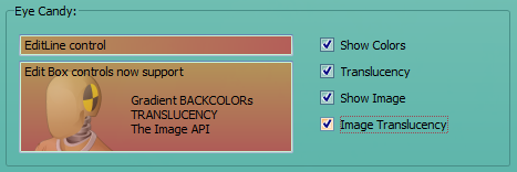


 Building OpenInsight 10